The TM Studio was briefed to rebrand the Spotify Payments team, it started out as a simple logo design project but grew into a much deeper branding project.
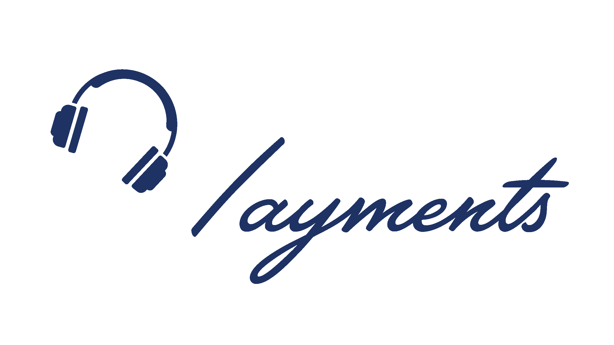
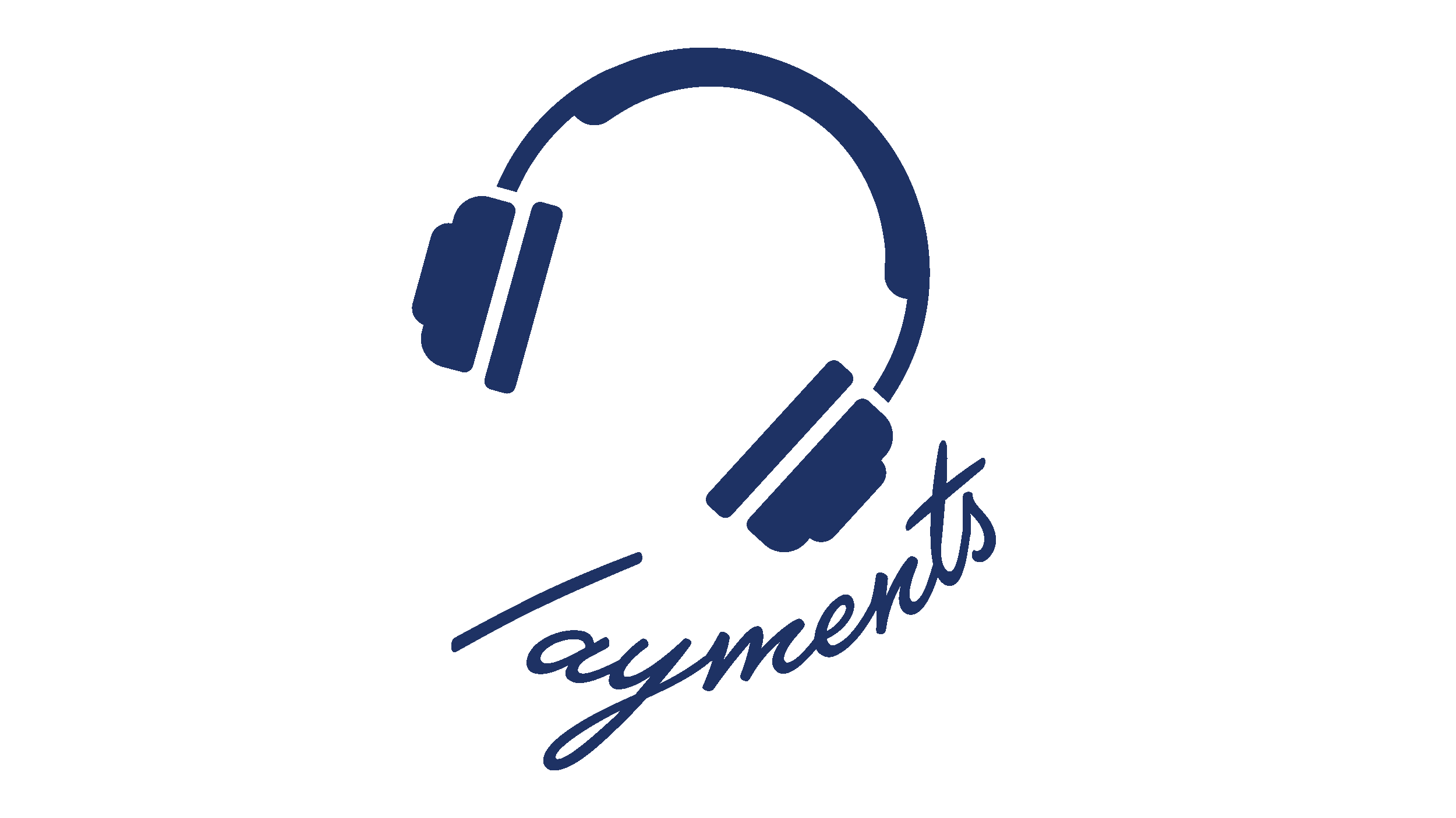
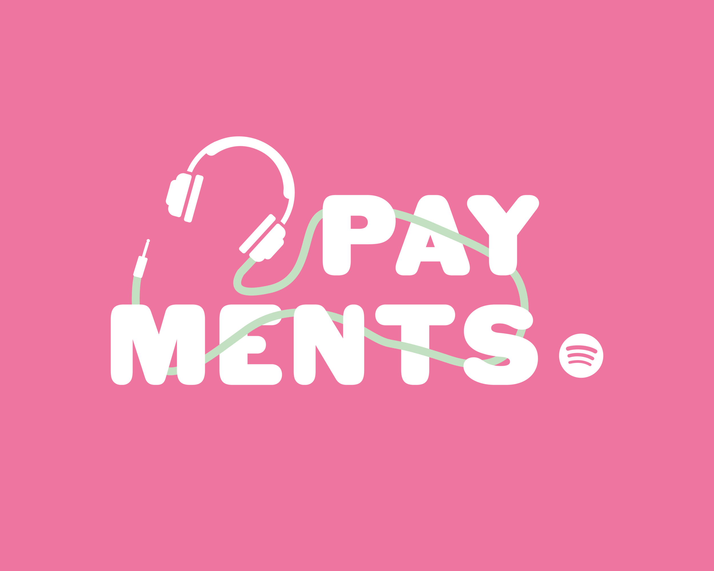
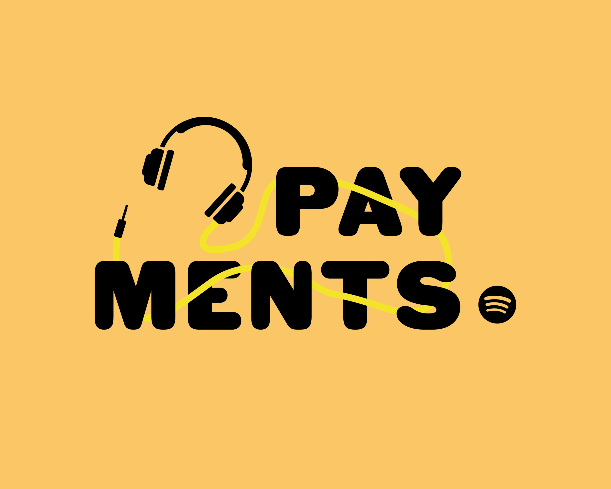
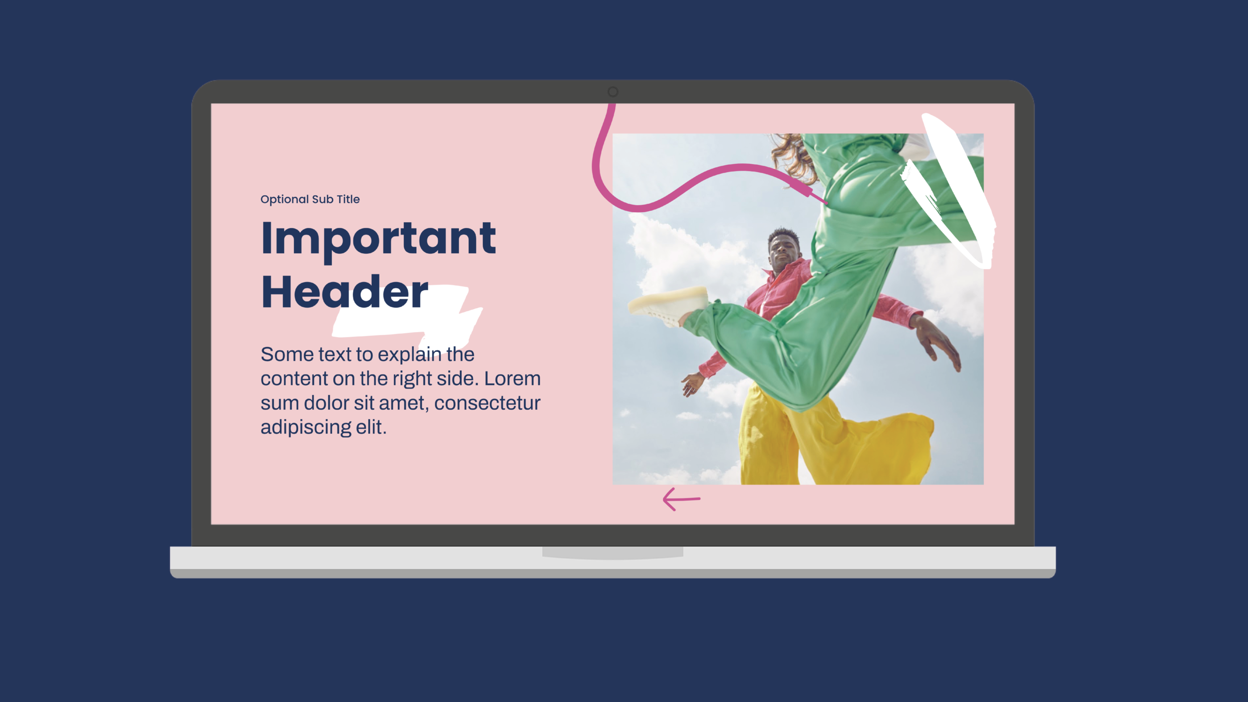
Above you can see a selection of the final logos chosen by the client – their core concept was to inject a sense of fun/dynamism to their team whilst also nodding to the musical aspect of the wider company.
This was to be used across all communications for the team both internal and external in the form of email signatures and within presentations.
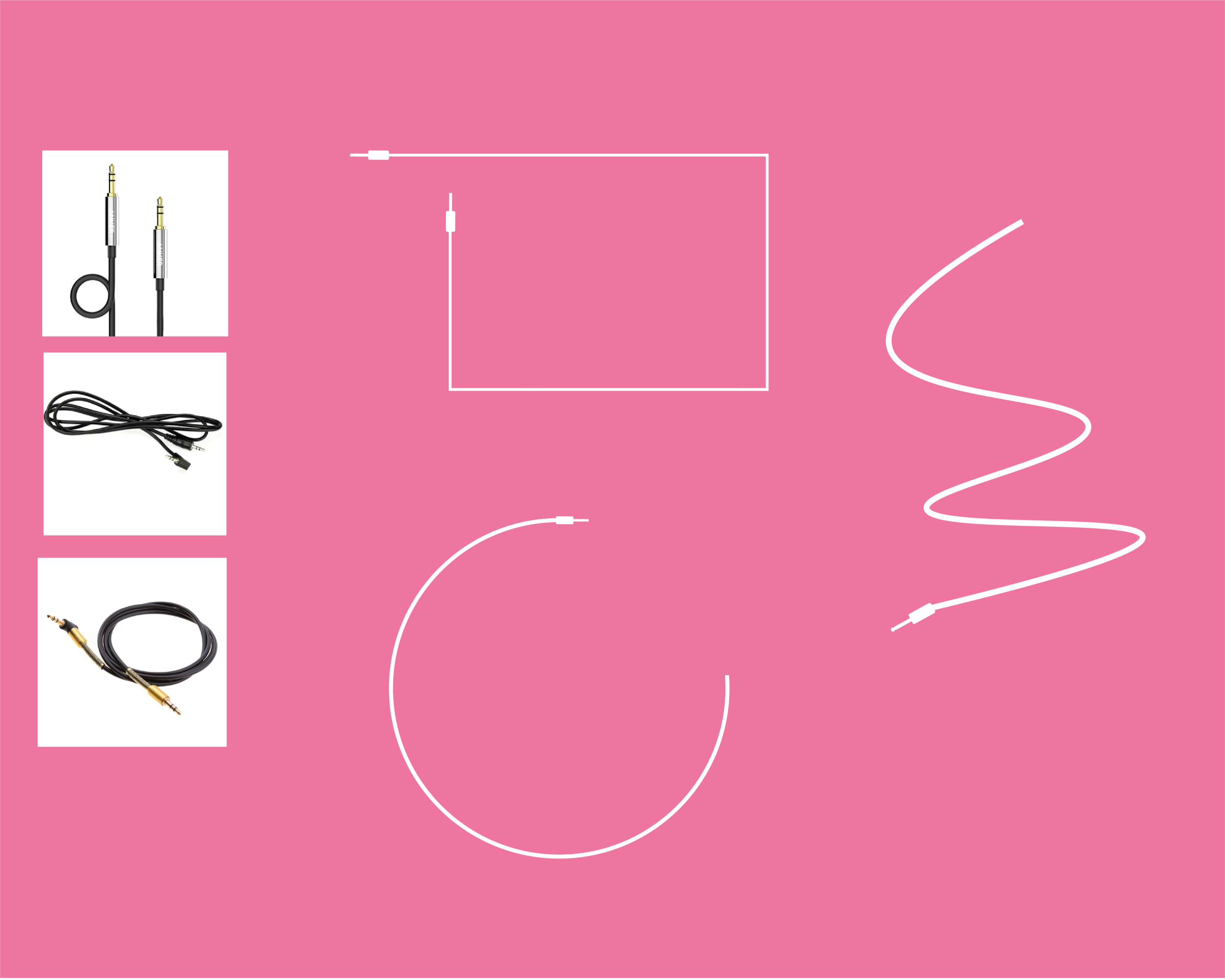

Above are examples of early development of the brand assets, the client had asked for a logo that interacted with an aux cord – supplying us with their initial sketches of the direction they wanted the branding to take. It was our task to take their ideas and start to put together designs that could translate into a wider brand.
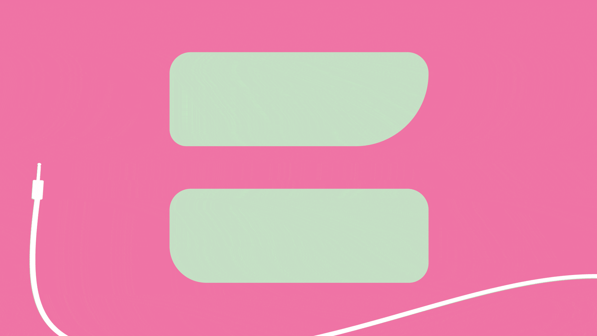
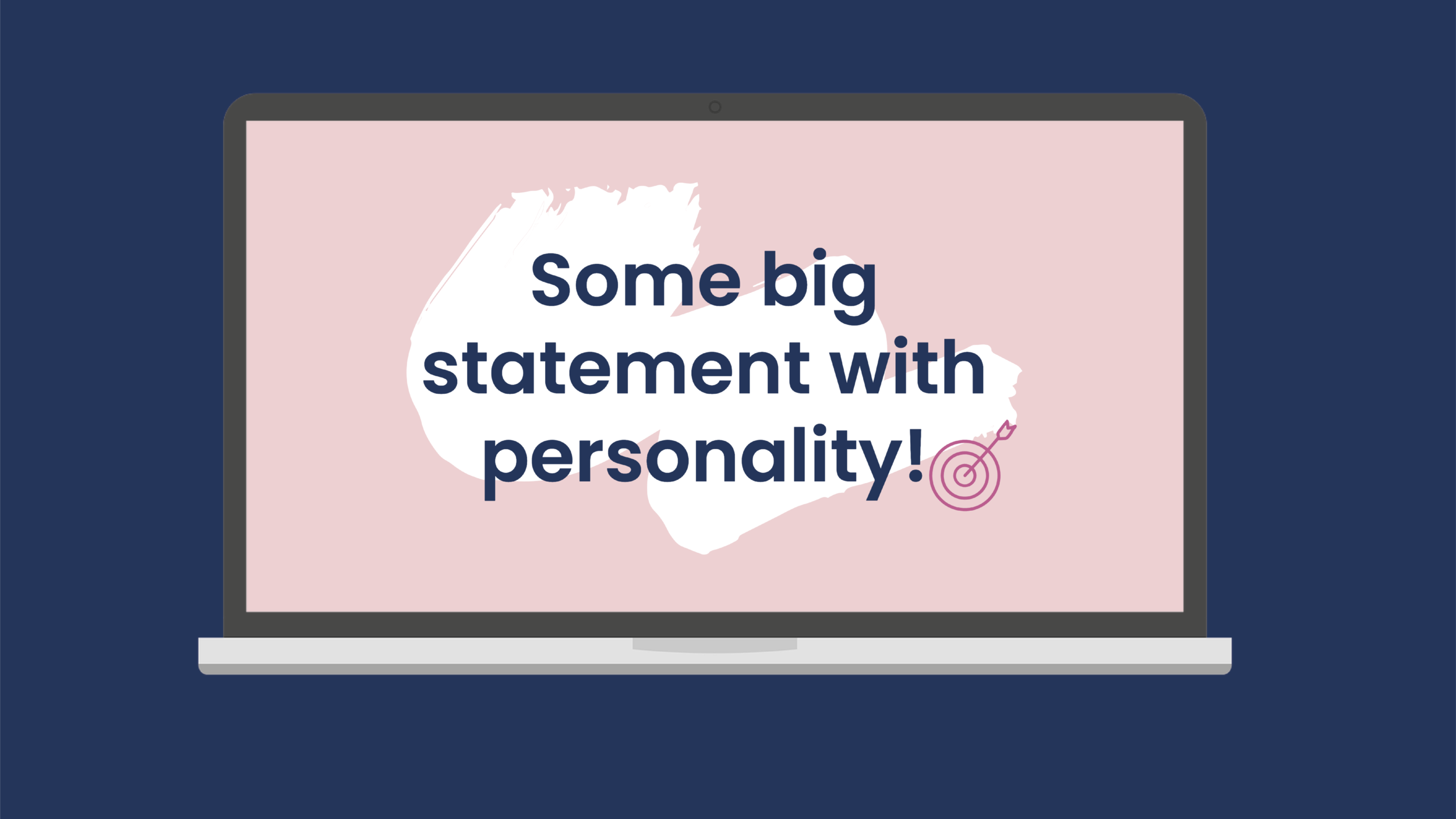
The designs above show the use of the aux cord within an early version of the logo, along with how it could be used as a motif within their slides.
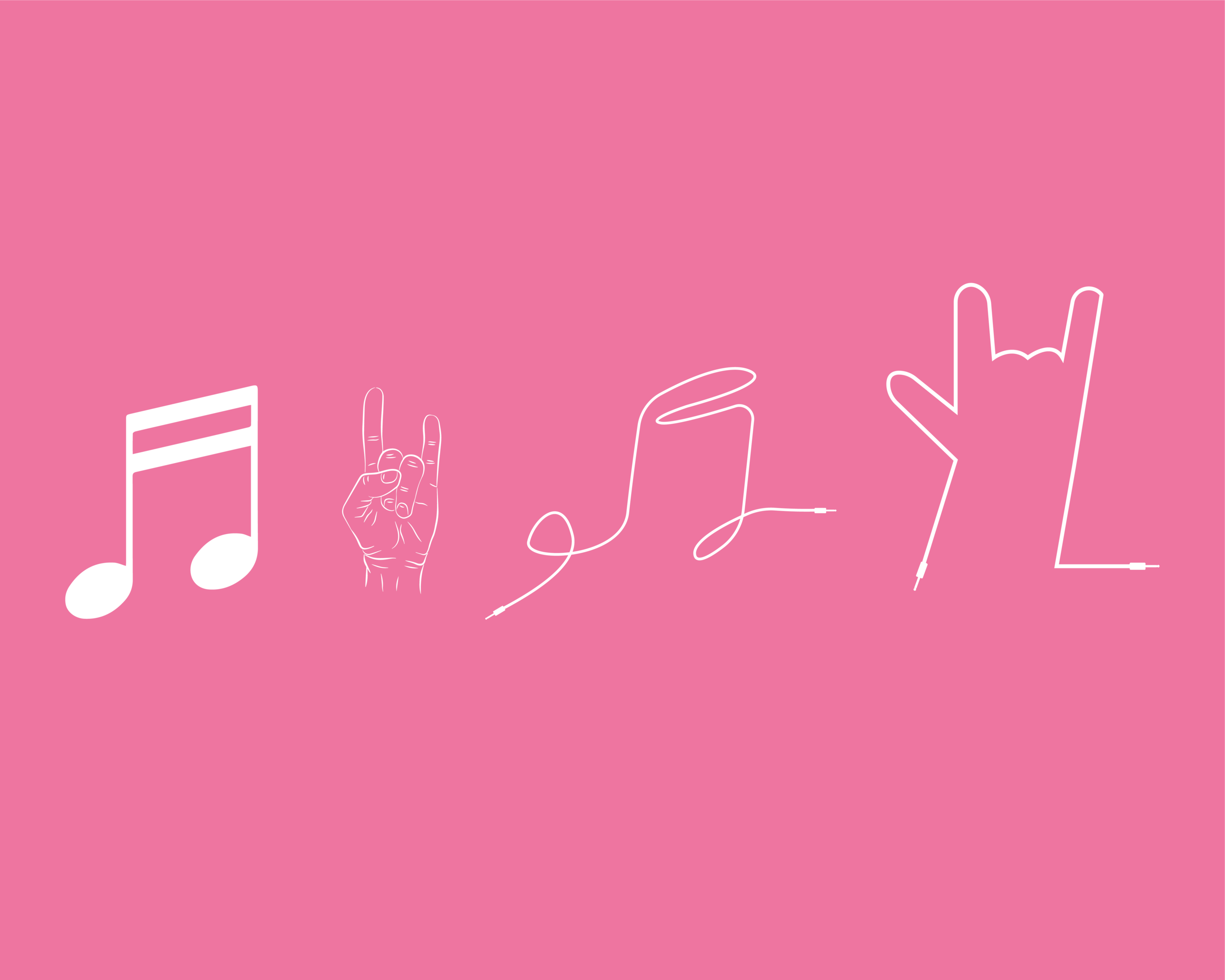
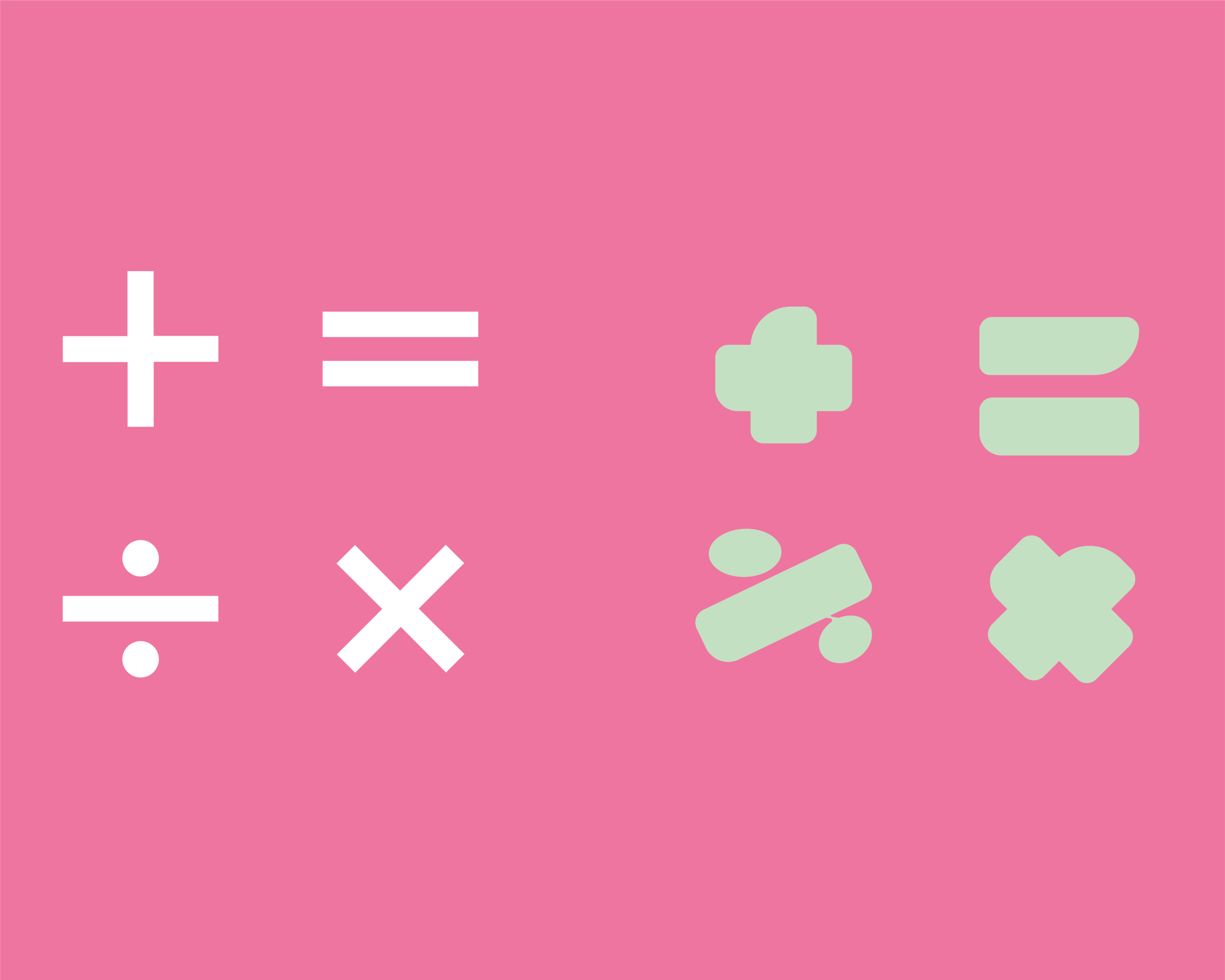
The use of ‘burst’ shapes are also central to how Spotify teams brand themselves – getting these right was a key part of the overall project. We started with the idea of combining music and mathematical symbolism and seeing how far we could deconstruct them into abstract forms, to avoid them pulling too much attention.
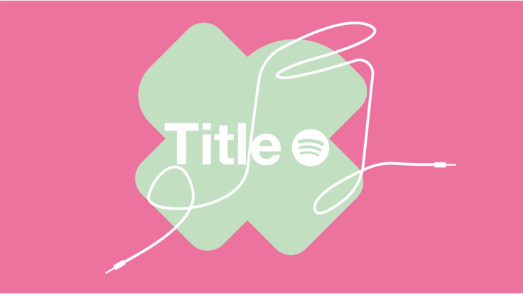


An example of an animated slide – combining the aux and the ‘burst’ elements. The intended use for this gif was to be used as a title slide for presentations to give the brand a feeling of dynamism and energy, a focal point of their rebrand.
The feedback after this round of development was generally positive, although there were changes to be made:
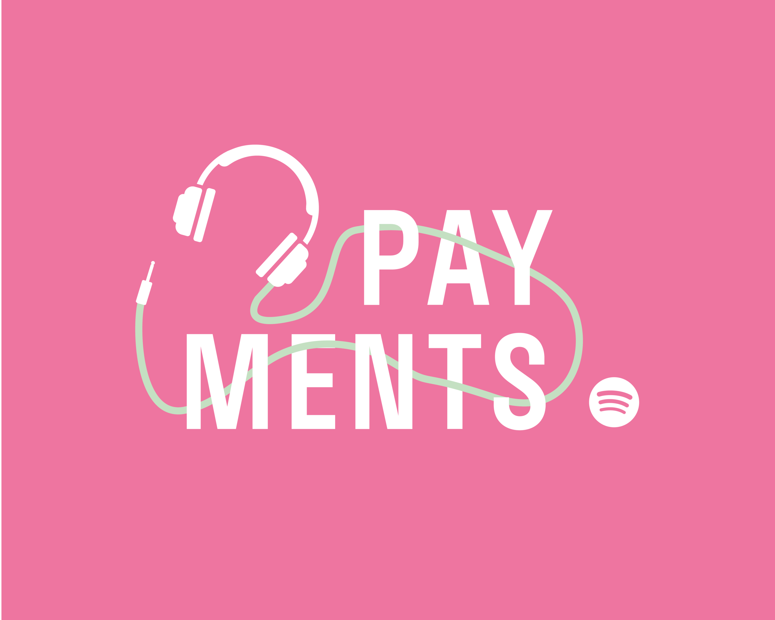
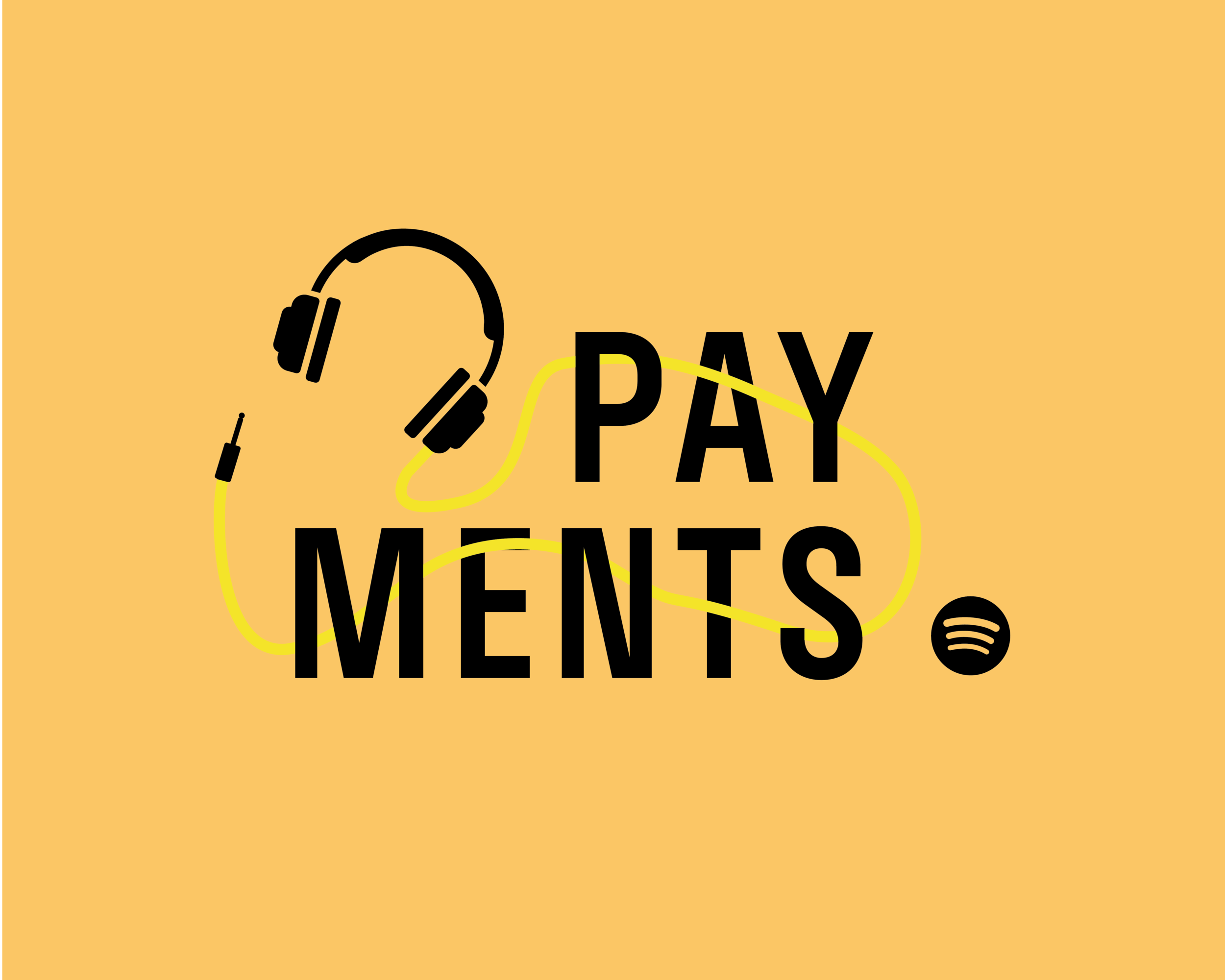
The client wanted to explore different colour variations that were within the Spotify brand guidelines.
The client liked the Aux as a motif and wanted it to write out the logo.
The bursts needed more work – they liked the idea of using conceptual shapes but wanted the bursts to move away from mathematical symbols.
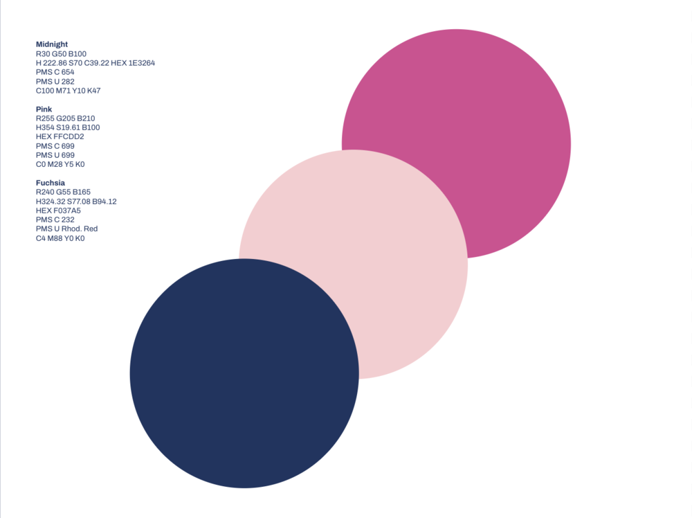
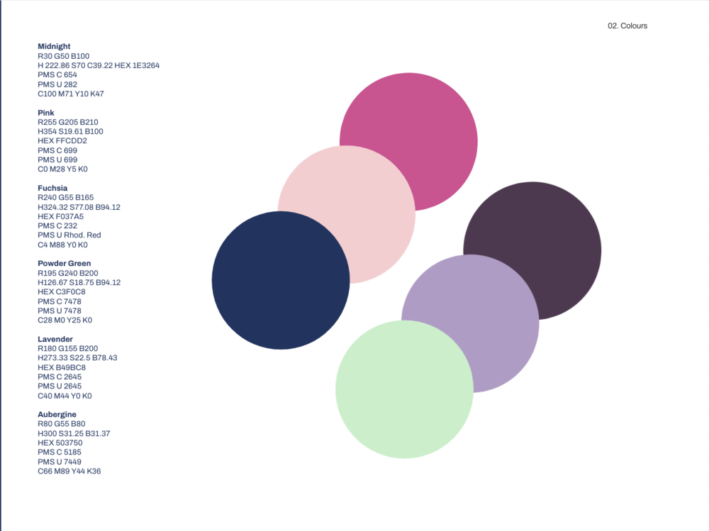
The selected colour schemes. It was important to keep the colours simple as they would have to be used by the clients when creating decks/presentations so we would have no control of their choices of colour pairing. Providing too many choices would run the risk of colour clashing and would potentially dilute the brand identity.
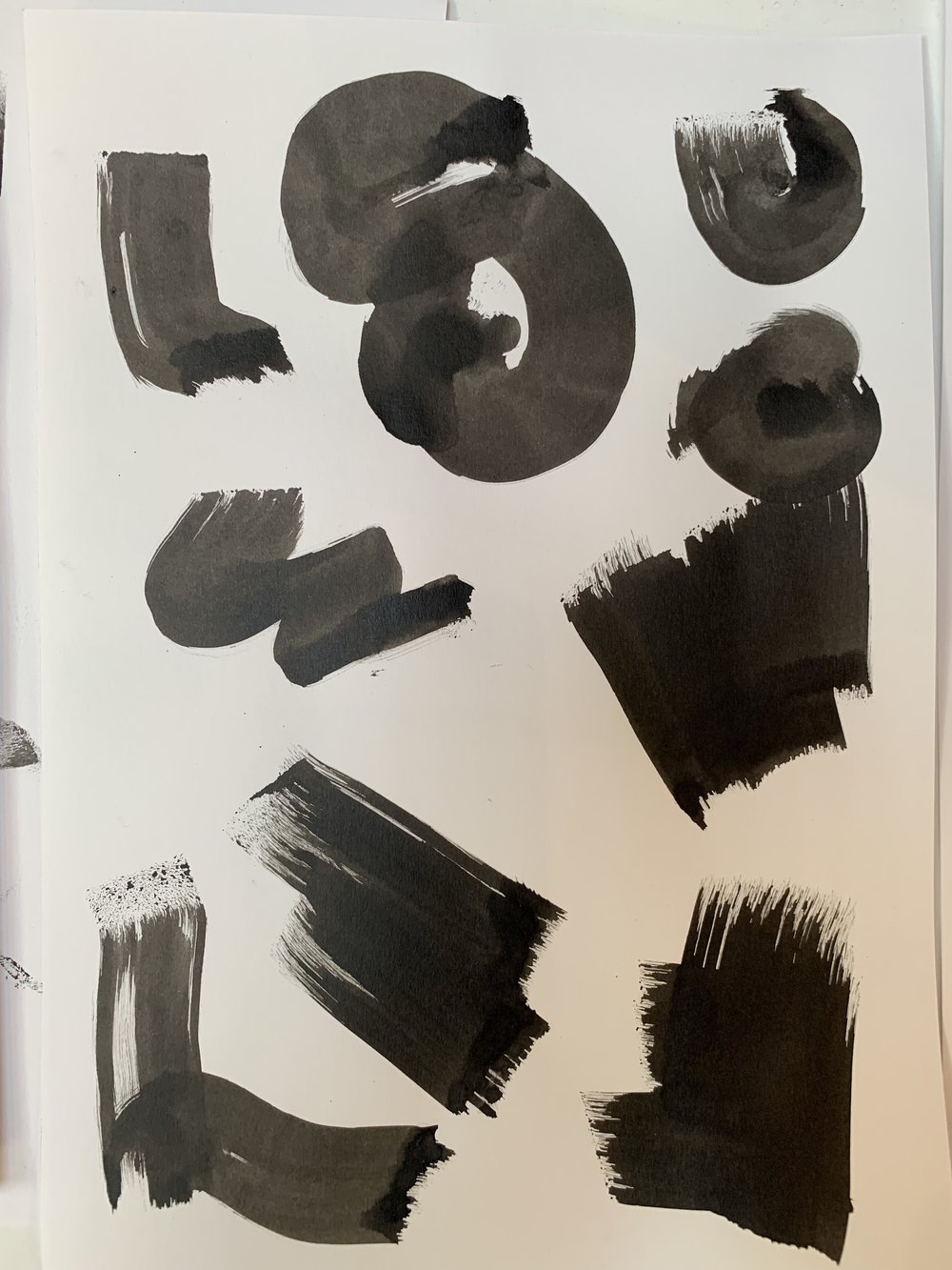

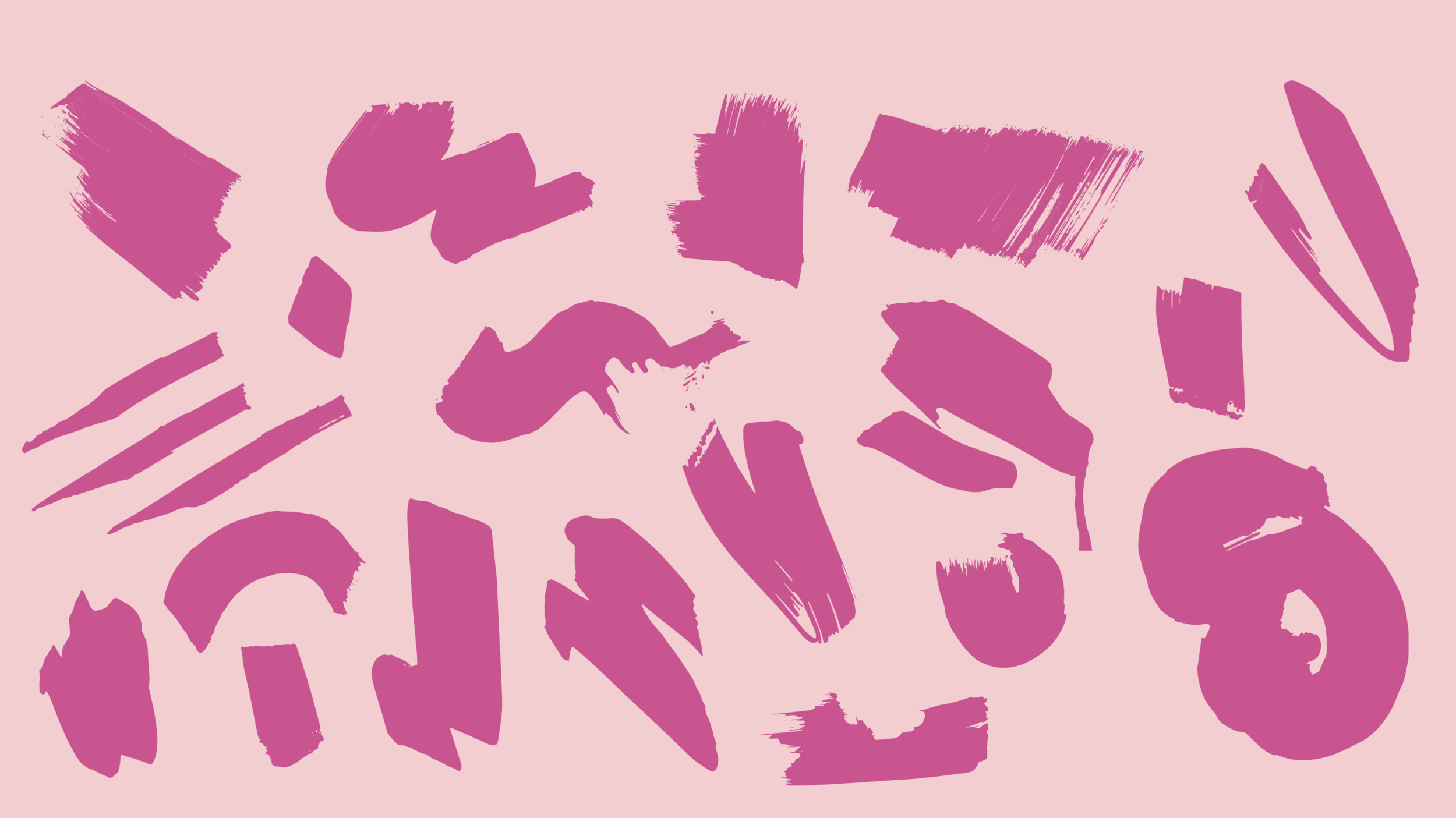
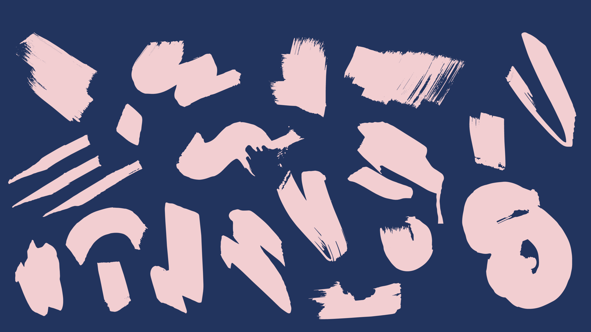
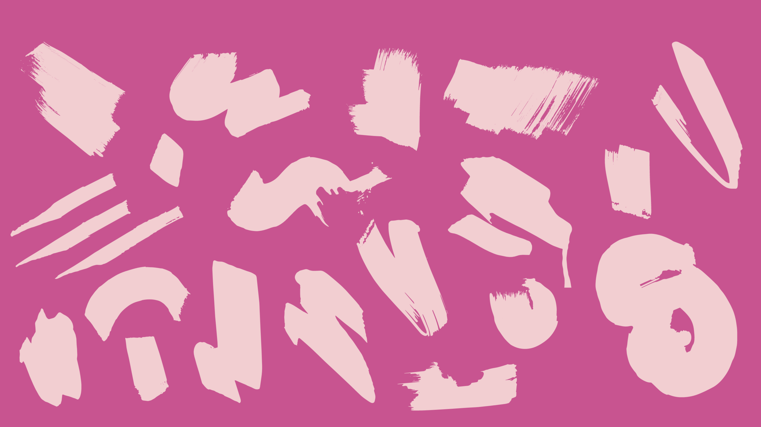
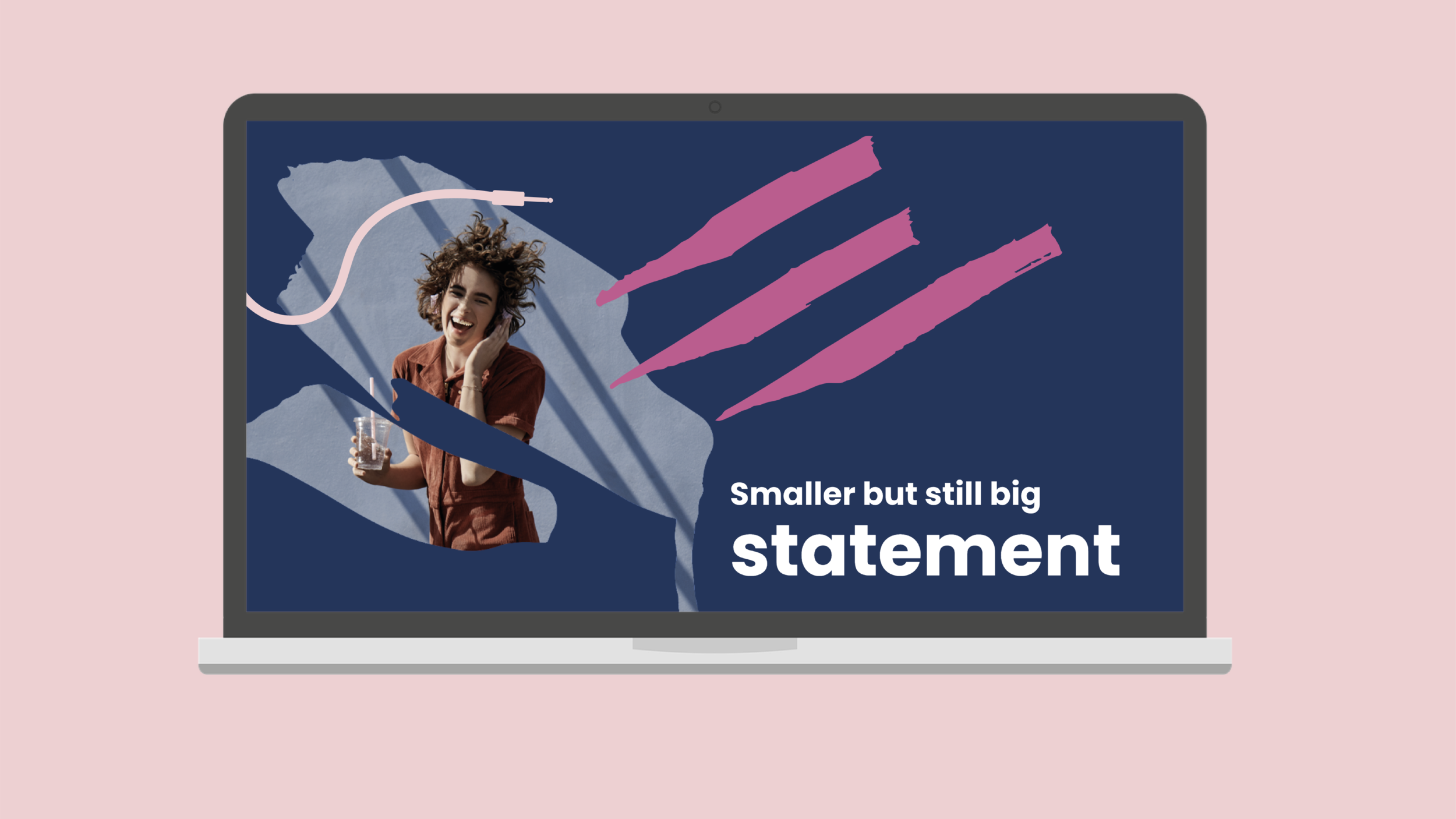
The Payments team felt that they play a wide variety of roles within the Spotify company. The concept behind these bursts was to create a range of marks and shapes all being made by the same brush, representing the different tasks and jobs held by the Payments team in a conceptual and dynamic way.
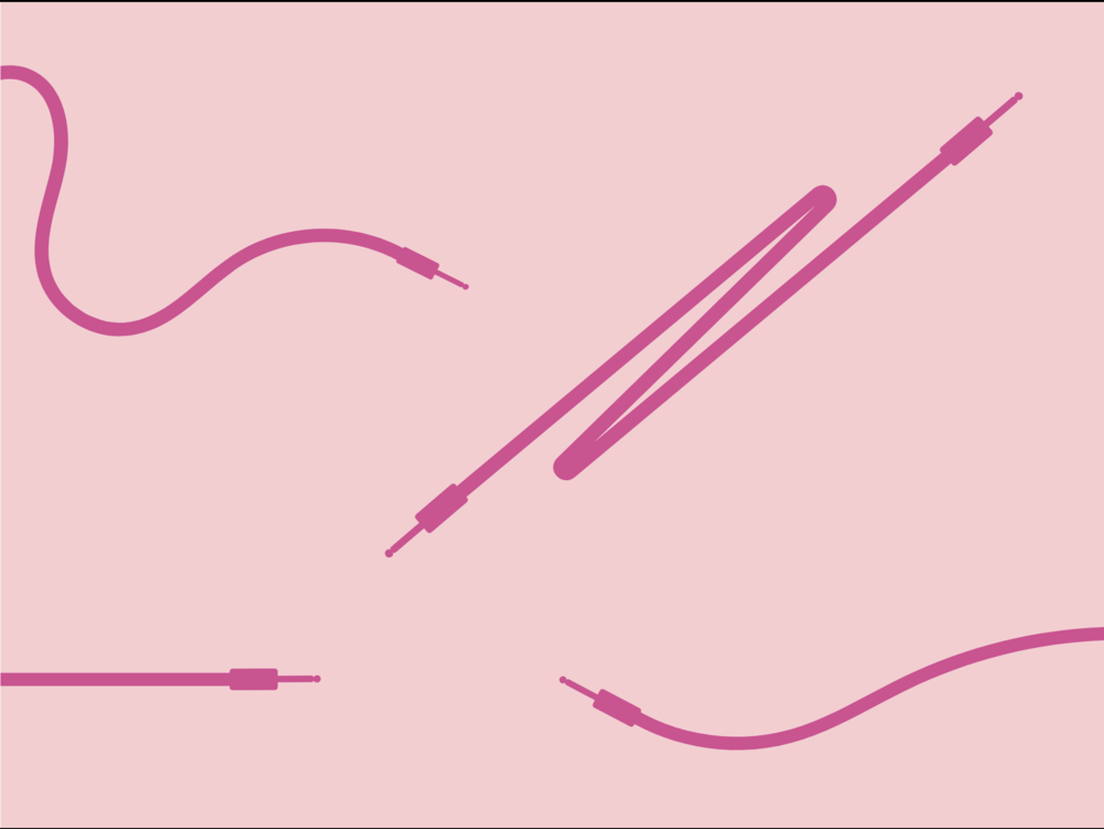
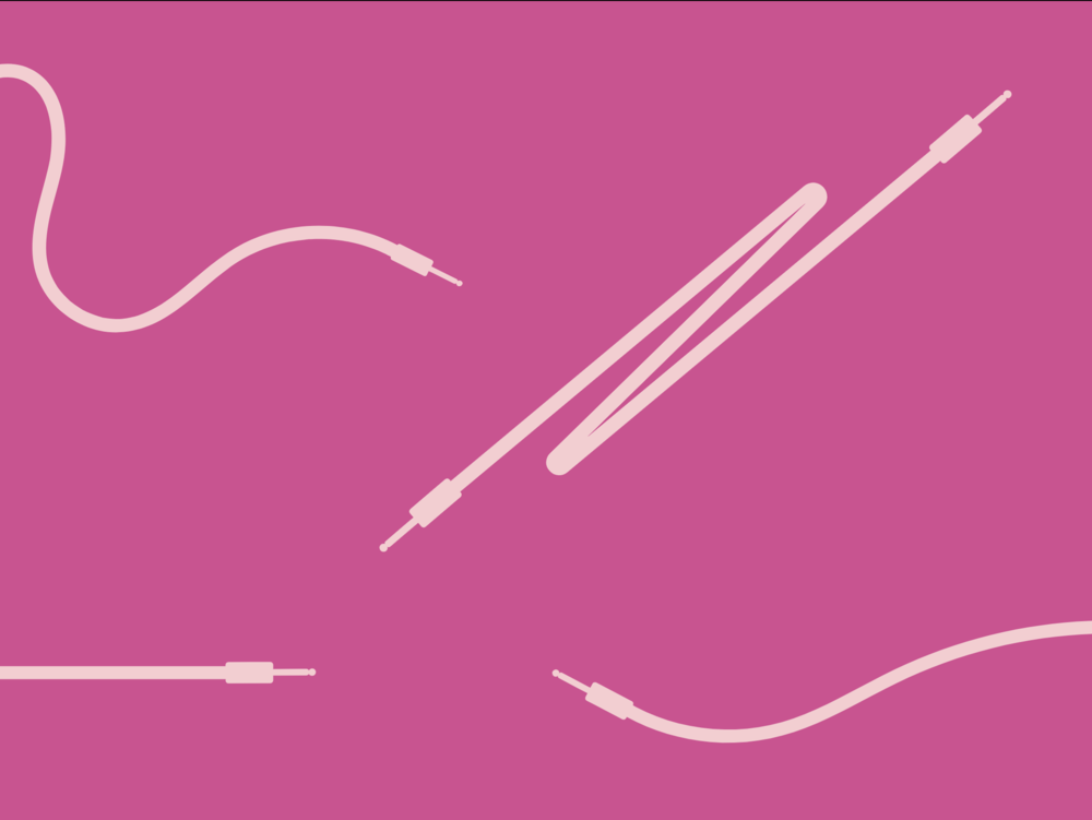
Refined and simplified aux designs – to flow through the brand.

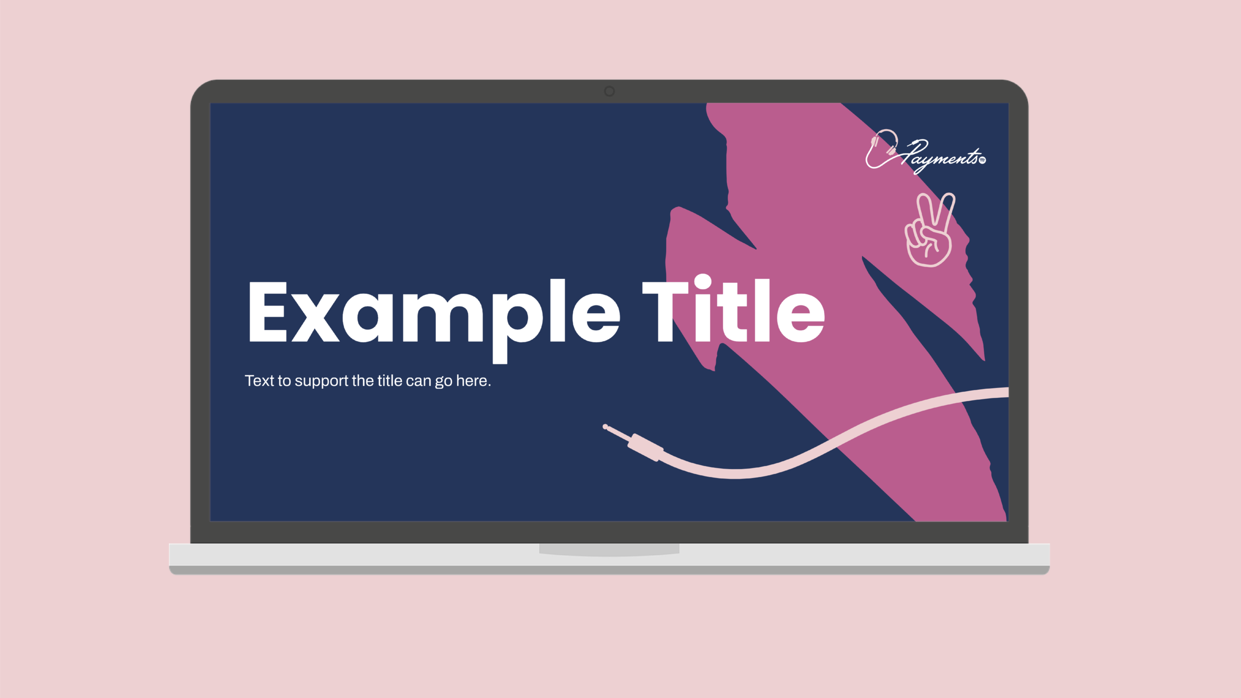
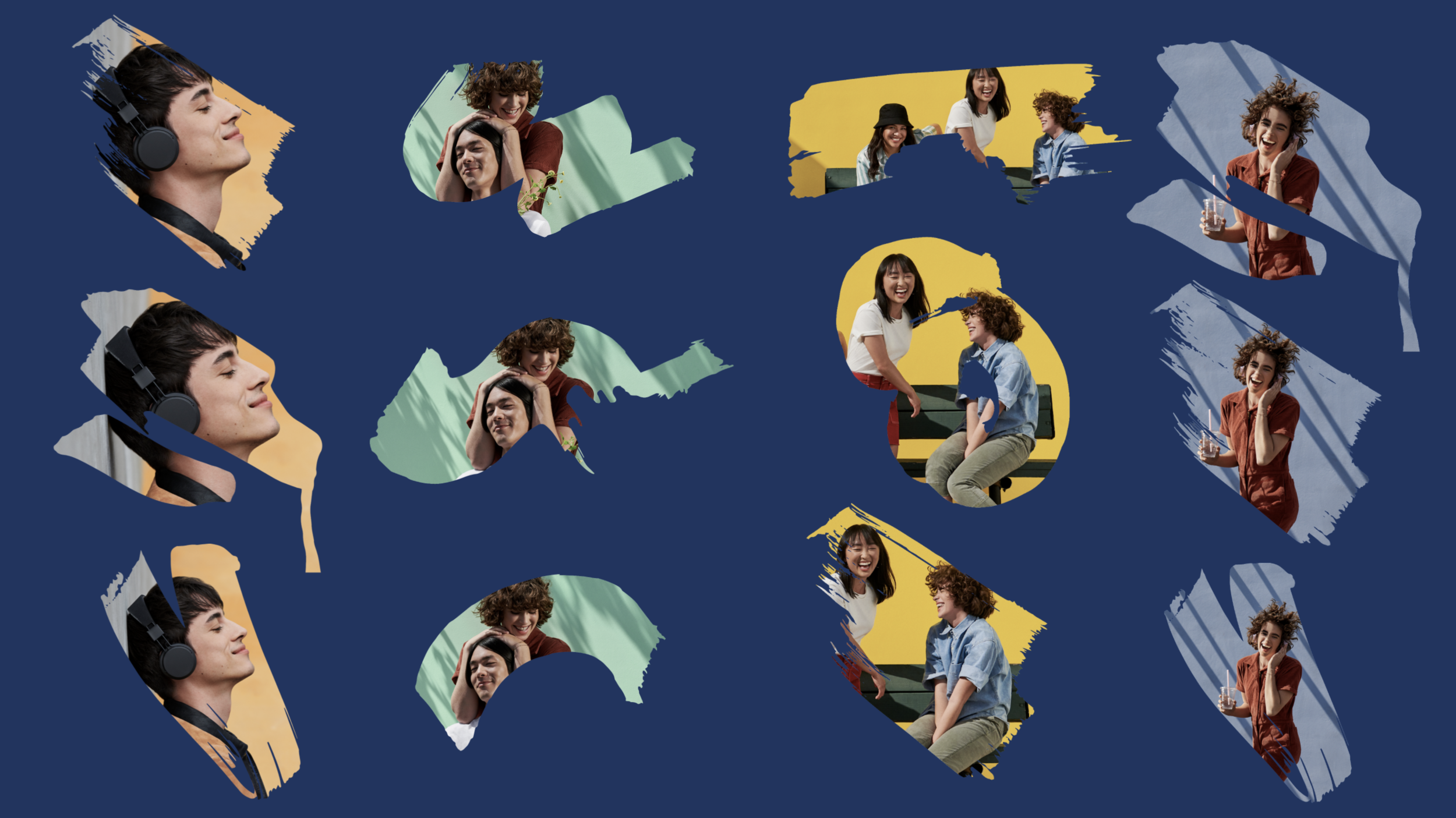
Above you can see the finalised assets within use of a deck. When handing this project over to the client we created template designs to demonstrate use of the assets and how they can be used to elevate their presentation designs.
Ultimately this was an incredibly successful branding project with some fantastic feedback from the client. It was exciting to see how the project developed from the initial stages and grew as we went on.